Word of Hands
MOBILE APPLICATION PROTOTYPE
Design For America
October 2017 - June 2018
AT A GLANCE
Word of Hands is a prototype of a mobile add-on to popular reviewing applications like Yelp. Its main purpose is to provide a platform for people with Deaf accessibility needs to easily find and provide reviews for different businesses, allowing the Deaf community and those involved to be able to browse this information more easily and better make informed decisions.
My Collaborators: Sanika Moharana, Steven Phung, Ana Dasgupta, Vidya Raghvendra, Miriam Wagner, Josh Duhay, and Tommy Sharkey
ROLES
User Researcher: I personally conducted 4 interviews to get to know our population better; I talked with a Deaf professor, an interpreter, a researcher, and a Deaf student. These were conducted for the sake of gaining a perspective from the inside on issues that each has come to learn about in their unique situations.
UI Designer: With the rest of the team, I collaboratively designed our final product's screens with 3 iterations of increasing fidelity. Throughout the whole design process, we continuously validated the problem and our design with Tommy, our Deaf ally. I also designed the product logo.
DESIGN GOALS
Research
At the beginning of our project, we were tasked with designing a solution that addressed the broad issue of accessibility. To narrow down our scope into an area more specific and more concrete, we decided to do some independent research on areas of accessibility that interested us. Through this initial round of research, we found that the issues surrounding Deaf accessibility were not only the most challenging, but also the least addressed.
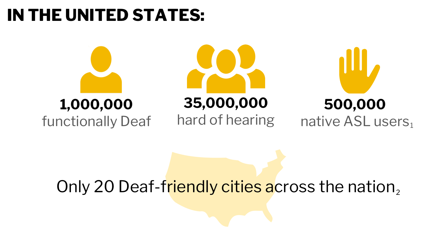
An infographic summing up our most prominent findings.
1Statistics were obtained from a 2005 research study conducted
by Ross E. Mitchell at Gallaudet University.
2This statement is based on a report by Deaf411 from a 2008
nationwide survey.
So, our goal started to take form in its initial stages from our desire to alleviate some of the statistics we discovered. After our initial stage of research, we delved deeper by conducting multiple interviews with people involved with the Deaf community, including Deaf students themselves, as well as Deaf researchers, interpreters, Deaf educators, and members from Gallaudet University, a private university for educating the Deaf and hard of hearing.
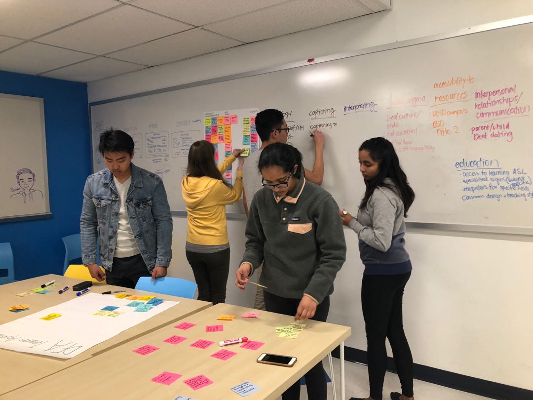
We categorized the different potential areas we could address and organized them into clear sections for us to more easily browse and draw general conclusions.
Pain Points
After consolidating the insights we gained through these interactions, we were able to draw some solid conclusions and began brainstorming potential pain points that we could address with our solution. In the end, we narrowed down our focus onto a specific cascade of pain points. Our purpose for constructing our pain points was to reach a need that we could tangibly and feasibly address, while still ensuring that we were on the right track and designing a solution for something that was prominent and relevant within the Deaf community.
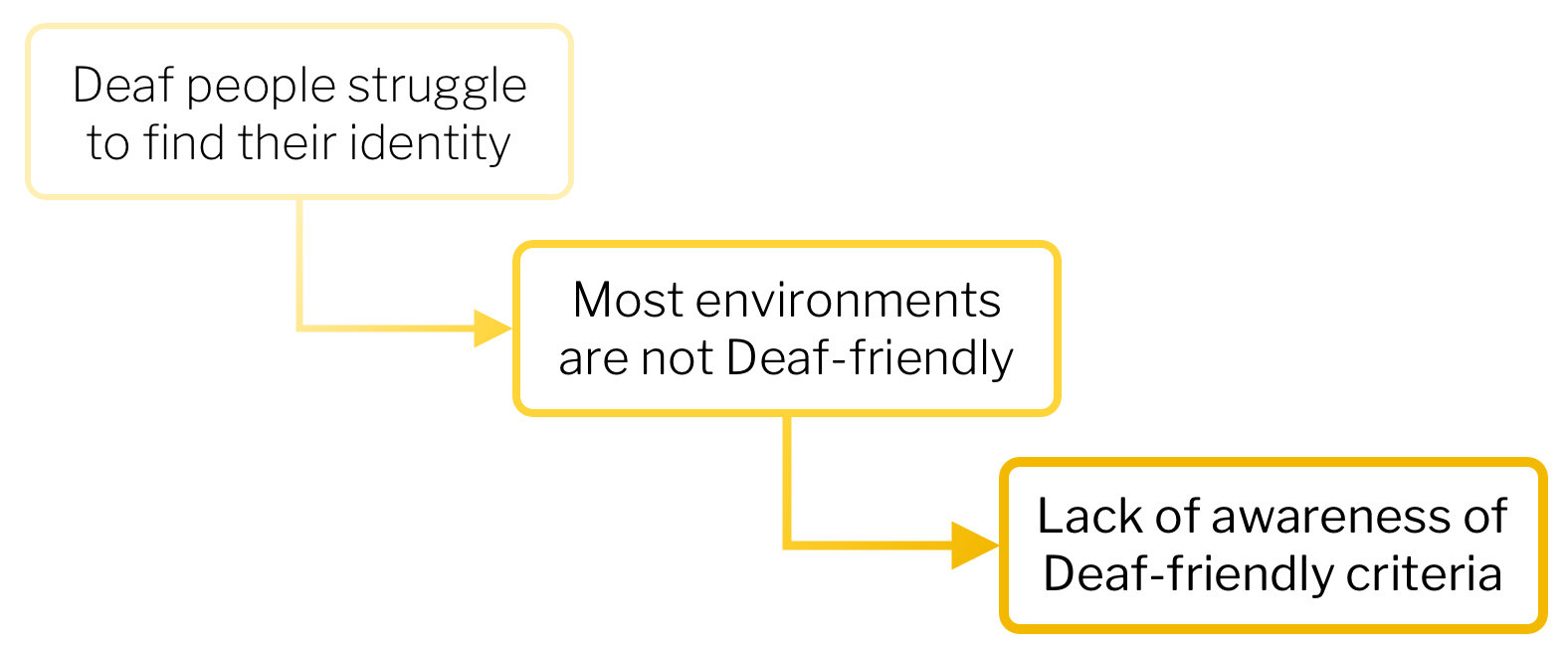
A cascade of pain points discovered from our interviews and research. Each cascade is the root of its previous pain point and simultaenously increases in tangibility and feasibility.
With the completion of all of our interviews and our pain points fully fleshed out, we finally felt that we had a solid grasp on the needs of the Deaf community. To guide our design process, we constructed a clear design goal:
Design a solution that promotes awareness about what it means to be Deaf-friendly and helps people easily find information about Deaf-friendly spaces.
FINAL SCREENS
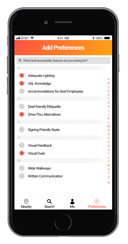
Sign Up
The application
relies on personal accounts created by users, which contain
information about their own accessibility preferences. The
criteria for Deaf-accessibility were established after
consolidating our research and interviews.
Search
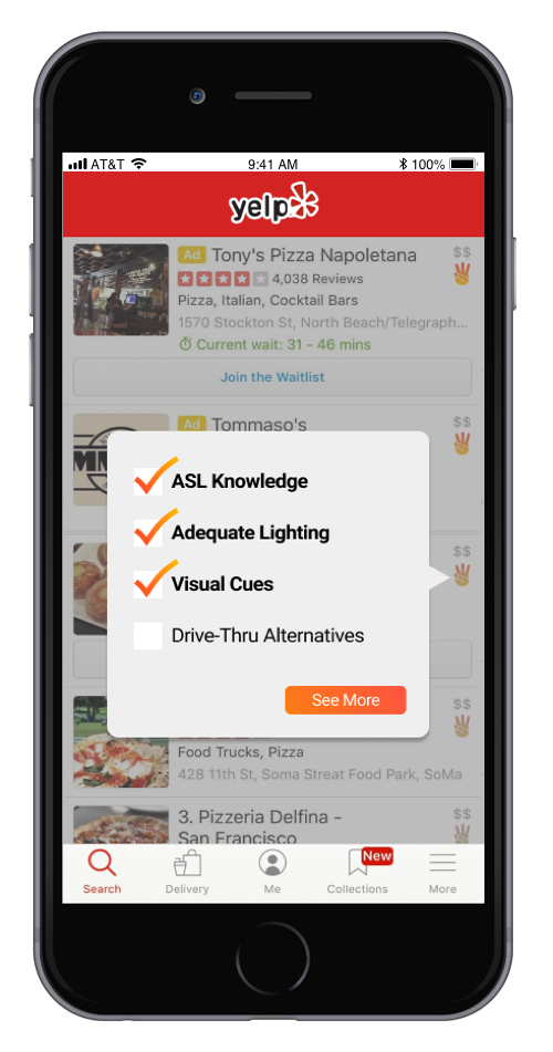
After syncing our
application with a review app like Yelp, our icon appears next to
search results to signify how well the business fulfills the
user’s personal accessibility preferences by the saturation of the
icon.
Info
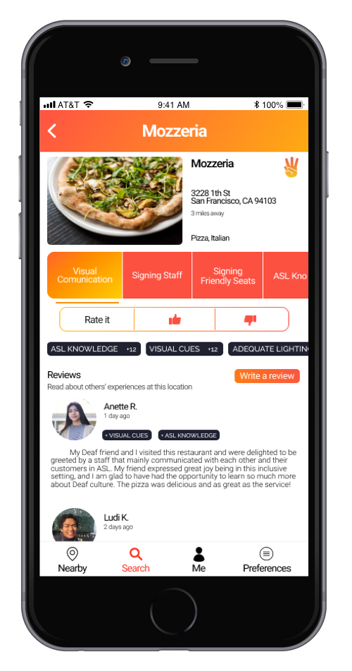
Each business has a
new page dedicated for displaying accessibility information.
Ratings and reviews can also be viewed on this page, which come
from other users of the application.
Review
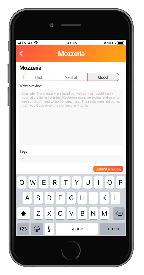
With the
crowdsourced approach of the application, users can leave their
own reviews after visiting an establishment. This way, the
information in the application can remain up-to-date as the needs
of the Deaf community evolve.
DESIGN PROCESS
To begin our design process, we needed to first figure out what kind of platform or medium we would be utilizing. We considered several possibilities, including non-digital solutions, such as designing a physical study space at UCSD that adheres to Deaf-friendly guidelines and supports inclusivity. However, we met some roadblocks as we'd need to coordinate with the school itself to get an area to work with, as well as come up with a large budget. In choosing to target a digital platform, we found several interview insights extremely useful as justification. One, particularly useful, came from the Deaf ally on our design team, who was also the UCSD ASL Club President.
Deaf people are more tech-savvy. They use technology to solve their problems because it plays to their strengths.
Tommy Sharkey, ASL Club President
Competitive Analysis
With our sights set on a digital solution as the most accessible platform, both for us as a team to work on, and for Deaf people to utilize, we began brainstorming the different routes we could take. Among these was the idea to facilitate reviewing businesses for Deaf accessibility features. Our team decided to explore this option further by doing a competitive analysis of existing platforms that purport to address this need.
AccessNow is one of the most modern solutions out there. However, it targets a large range of accessibility needs, including other physical disabilities, and also contains only a limited number of businesses in its database.
DeafFriendly is targeted specifically towards Deaf accessibility features. However, like AccessNow, it only contains a limited number of businesses in its database, and it seems to be underused and inactive.
AbleRoad was a website that provided a wealth of specific accessibility information for users to browse and add on to themselves. However, the website has actually been shut down since we analyzed it and when it was up, it definitely showed its age with outdated designs and an inefficient user flow.
Above all, we found that all of the competitors we analyzed suffered from the same issue: they became obsolete and outdated due to inactivity. Not many people knew about these solutions and without an active userbase, the solutions were unable to be sustained. We saw this as an important issue for us to address when designing our own solution, and this is largely what led us to develop an add-on rather than a standalone app. By connecting our solution with something that already exists and is popular, like Yelp, we'd have a higher chance of maintaining an active and self-sustaining userbase.
Another issue that we identified was the ambiguity behind "Deaf accessibility." For most people, this blanket term can be hard to parse for specifics, especially if they have not had many interactions with Deaf people. As a team, we also made it our goal to clarify this ambiguity by delineating specific criteria for evaluating Deaf-friendliness. By doing this, we hoped to not only provide a strong basis for our review system, but also guide businesses with specific steps for becoming more Deaf-friendly.
User Flow
Having established our platform, we definitely wanted to map out the general userflow to ensure that our application would be easy to learn and straightforward to use. The most important thing for us was to unify our mindsets on what audience we were to reach and how our application would change the experience of looking for businesses to visit for the better.

The final userflow that we decided on. We placed the most emphasis on the fact that our application should help people easily find Deaf accessibility information without any prerequisite knowledge about what businesses could potentially fit their needs. The entire process should be quick and satisfactory.
Design Iterations
The next step of our design process was simply sketching out the screens that would be necessary to fulfill the user flow that we had outlined. Our first iteration was sketched on a whiteboard, in extremely low fidelity to simply establish the baseline flow. After bringing our designs to Tommy, our Deaf ally, we incorporated his feedback and criticisms into a second round of iterations. This was also drawn on the whiteboard, but we went more in-depth with the details on each screen to prepare the designs for another, higher-fidelity iteration.
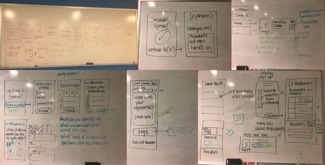
Our first iteration can be seen in the top left. The other pictures are from our second iteration, for which we carefully planned all functionalities through discussions and incorporating feedback and research.
With our designs finalized in low-fidelity, we took to the computer to flesh out the actual screens in Sketch. Throughout this whole process, we constantly validated our ideas with Tommy to ensure that we were staying on track. In total, we implemented 3 iterations of design, the third being the final screens displayed above.
CONCLUSION
As a reminder, our initial design goal was as follows:
Design a solution that promotes awareness about what it means to be Deaf-friendly and helps people easily find information about Deaf-friendly spaces.
At the end of our project, we had addressed all of the main needs that we sought to. We effectively helped promote awareness about Deaf accessibility by creating a platform for people to view and rate Deaf accessibility features. Furthermore, by linking this platform to an existing platform that is already popular, it would be more streamlined and be able to reach people even outside of our target audience. This way, people who were originally unfamiliar with Deaf accessibility could now easily learn about it. Not only would our application benefit users, helping them easily find information about Deaf accessibility and become more aware in general, but it would also incentivize businesses to adopt Deaf-friendly practices.
NEXT STEPS
Continue Iterating: Although we were able to get 3 iterations of design done, retrospect makes me wish that we had spent slightly less time conducting interviews and more time on developing clear interactions within our prototype. While research and immersion is good, I feel that we could have started designing much earlier in the project term, which would have allowed us to push out more iterations. Specifically, I believe we could definitely incorporate more usage of icons throughout the application, as well as smooth out some of the minor usability errors that may only become apparent with increases in fidelity.
Develop Interactions & User Test: Going along with higher-fidelity iterations, our next steps would definitely include developing the interactions of our application and bring these interactions into user testing sessions. The best way to refine our design even further would be to test it on people who would actually be using the application.
TOOLS
Sketch
Figma