Focus
WEB APPLICATION
UCSD COGS 120
September 2018 - December 2018
AT A GLANCE
Focus is a desktop web application that facilitates distraction-free study sessions by rewarding nonstop study sessions. It was designed specifically with sick students in mind to help them catch up on missed work due to their condition, but can easily be extended to a broader audience of the general student population as a study aid.
My Collaborators: Edward Chen, Eunice Chan
ROLES
User Interface Designer: I led the design on all of the pages of our application, prioritizing both aesthetic design and basic usability principles. I also conducted a few iterations of simple user testing and heuristic evaluations with my initial designs to reach the end product.
Front-End Developer: I also led the development and coding of our actual application on the front-end side of things using HTML, CSS, and JavaScript. We tried to prioritize iterations as much as possible, but given the time span of this project, we were unable to go through full, independent iterations. I also worked closely with Edward, our back-end developer, to implement various web functionalities.
Just a note: our team was extremely inter-disciplinary, and each of us headed different aspects of the design and development process. Eunice is well-versed in user research and testing as a result of her previous experience, and Edward is a strong computer scientist due to his education. I thoroughly enjoyed working with a team like this because it helped me gain new perspectives on the design process.
DESIGN GOALS
Needfinding
At the start of our project term, my team was tasked with designing an application that enhanced health. For our preliminary needfinding, we observed students recovering from illness as they attempted to catch up on school work. This led to the discovery that they encountered a lot of distractions due to their condition, such as the need to drink water, cough, blow their nose, etc. On top of this, they were distracted by ordinary distractions as well, like notifications from social media or other websites. Below are a few examples of the needs we identified from our observations.
Unwell students need motivation to continue productivity when fatigued from illness.
Unwell students need a reliable way to catch up on lectures that are missed due to illness.
Unwell students need an easy way to relieve symptoms without interrupting their workflow.
We wanted to address this particular facet of health; not only in allowing students to study well while their physical health was affected, but also in alleviating mental health problems that may occur as a result of being fatigued from sickness and behind in school work. Unfortunately, with a digital solution as the project prompt defines, we would be limited to addressing only the digital distractions that might be encountered, and not physical distractions as a result of illness. But from the observations we gathered, we saw that the digital distractions simply amplified the interruptions that were already occuring physically. With these specific constraints on our project, we developed a clear design goal to help drive our process.
Design a solution that helps students stay focused even when they are distracted by outside factors and guide their study patterns to maximize productivity.
FINAL SCREENS
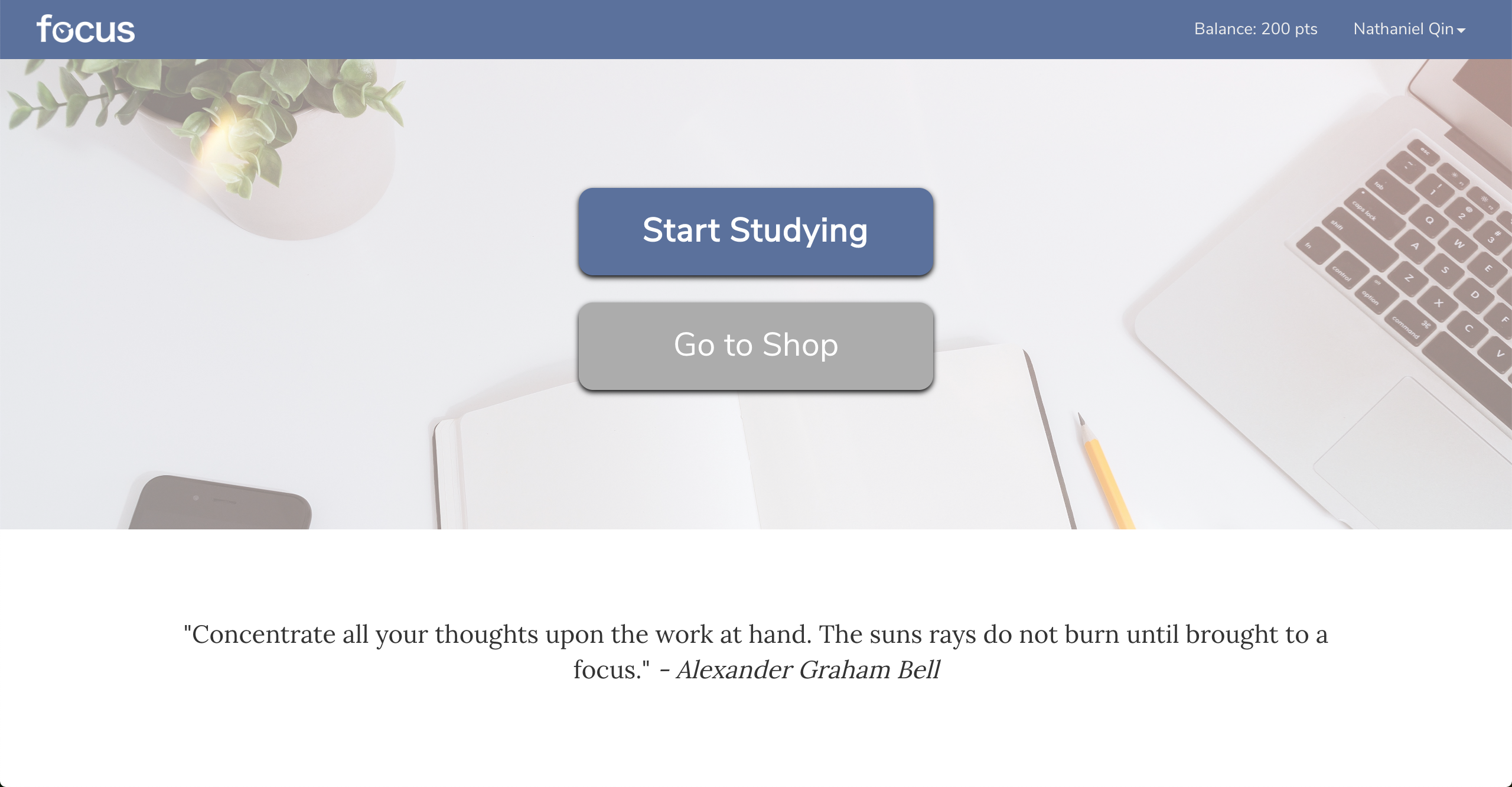
Home
The application has
two main functionalities: the timer and the shop. On this home
page, users have these two main options to navigate to. They can
either use the timer, which is equivalent to starting a study
session, or go to the shop, in which they can spend points they
earned from studying.
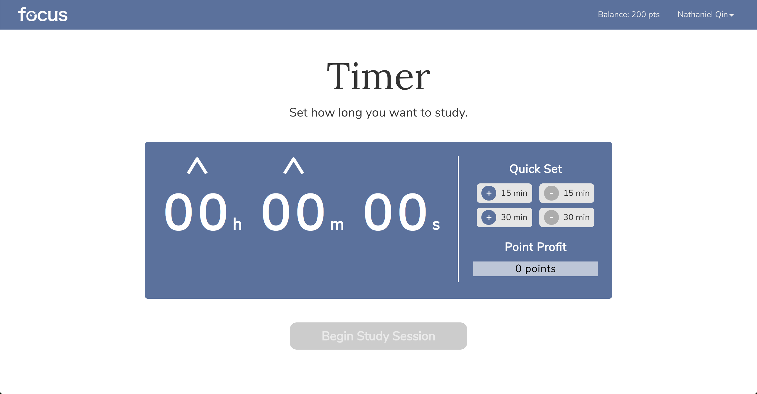
Timer
The timer serves as
the main study functionality of our application. Here, users can
set how long they want to study for and launch the timer. If users
navigate away from this page (by being distracted), their study
session will be cancelled and will not return any rewards.
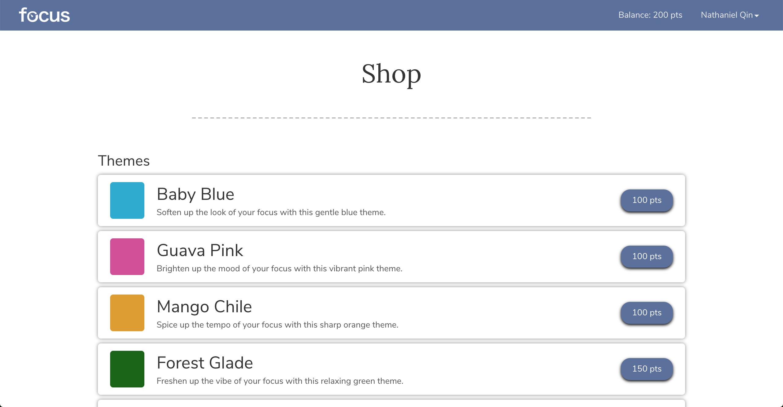
Shop
From their study
sessions, users can earn points to spend in this shop. As of the
project's end date, the shop sells color themes and animations,
but can easily be expanded to better rewards, including those
monetary in nature.
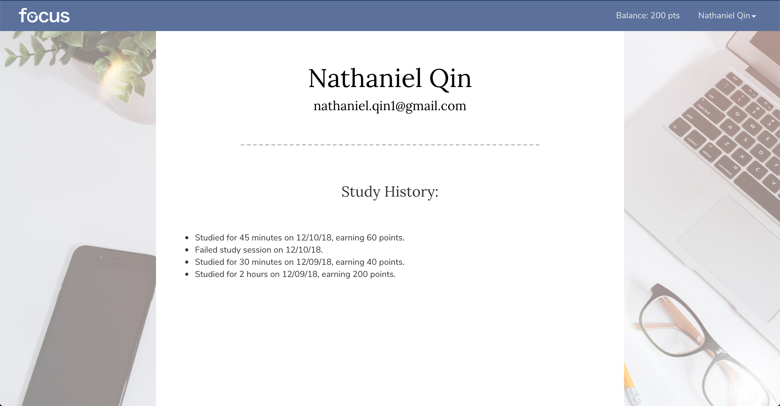
Profile
On each user's
personal profile, they can see the history of their study sessions
as well, including if they were successes or failures.
DESIGN PROCESS
Storyboarding
When we began to brainstorm ideas for our application, we wanted to first solidify not only our target audience, but also the kind of flow that our application would be able to provide. To accomplish this, we created a few storyboards. The ultimate purpose of these storyboards were to demonstrate the difficult situations our users face to the type of satisfaction they would receive from using our application. We wanted to clearly show this transition from start to finish, facilitated by our application. Below is an example of a storyboard we constructed.
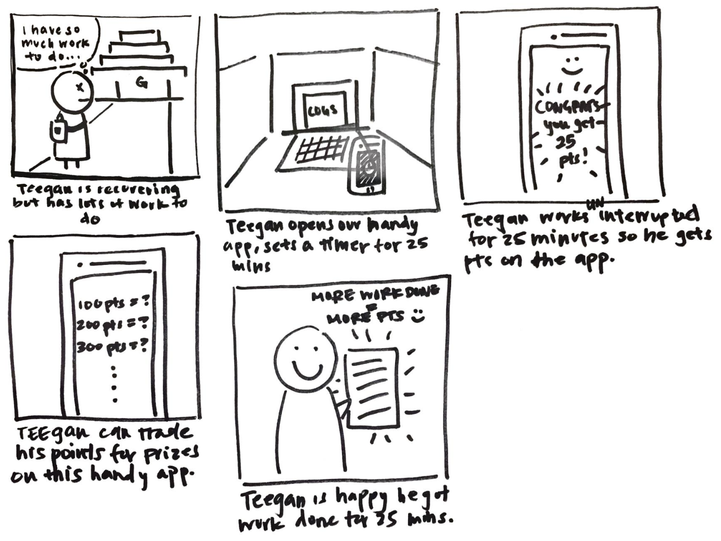
A storyboard outlining the specific way that our application would help alleviate stress. We wanted to show the process of incentivizing successful study sessions and the satisfaction resulting from that.
Paper Prototyping
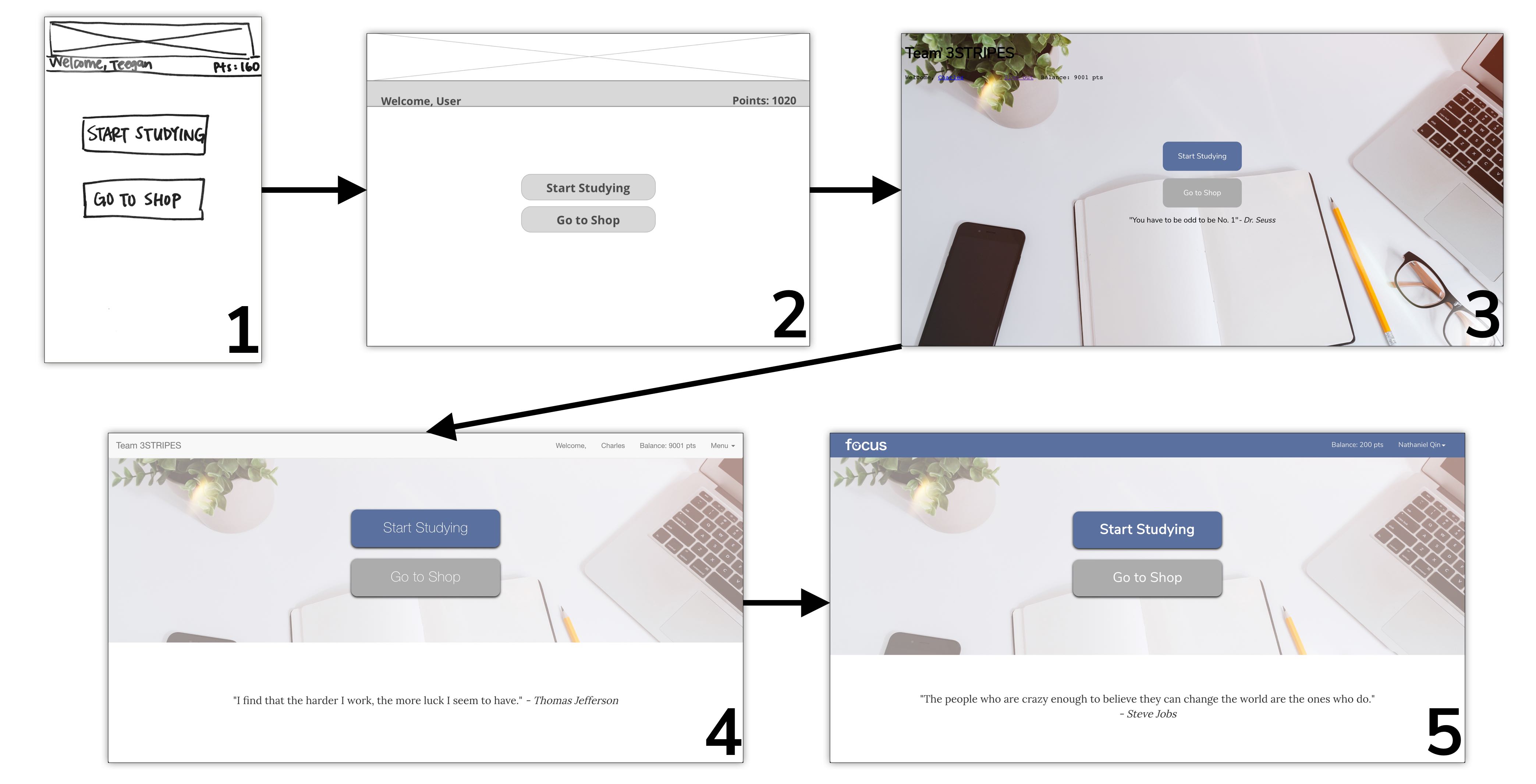
From our storyboard, we knew that we wanted to design an application that would, at its very core, function as a point-earning timer with a shop to go along with it. Having solidified this as our main design idea, we went forward with creating a paper prototype to demonstrate our ideas. The paper prototype is not meant to showcase detailed UI decisions, but rather the general flow of the application as well as broader interactions.
Design Decisions
The final product definitely deviated from the original design that was outlined in the paper prototype. However, that's a normal part of the design process. The initial design can't be expected to be perfect, and improvements are made naturally as iterations continue. One stark difference is the platform for which we designed the web application. Our paper prototype is designed for mobile, while our final product is designed for desktop.
So why did we decide to design for desktop instead of mobile? After considering all of our possibilities, we concluded that the application would just be overall more useful on desktop. Although we tend to receive more mobile distractions, There are already many existing solutions for reducing these, such as Do Not Disturb or airplane mode. Furthermore, because most studying does not require a mobile device, students could afford to even shut off their phone or place it in a different room. For desktop devices, notifications can often run free and cause many distractions. Originally, we also planned to allow users to whitelist certain websites so that they could utilize the Internet to study while still avoiding more distracting social media. Given our time constraints, we weren't able to implement this functionality, but it would have provided a much-needed solution for desktop distractions. Overall, we felt that there was a higher need for a desktop study aid to reduce distractions in that specific sphere.
User Testing
Of course, the platform is not the only thing that changed throughout the course of this project. The design of the website underwent many changes as well which can all be attributed to iterations, some of which acquired through user testing.
A visual demonstration of the numerous iterations of design we went through. Although we accelerated to high-fidelity designs rather quickly, we still completed a few iterations in the browser.
Having all of our designs and interactions in place, we conducted a few rounds of user testing with some potential users of our application. The testing sessions were extremely helpful because all of the members on our team had been staring at the application for hours each day. As a result, we'd become somewhat numb to its design, and by transition, its design flaws. The user testing sessions helped draw attention to some of the largest breakdowns that users could encounter.
The app looks great, but the timer page is a little confusing. I wasn't sure how to change the time by smaller time intervals.
Rebecca Hu, UCSD Student
That's a rather large flaw. The timer is part of our application's core functionality, and if it wasn't usable, then the application itself might as well be unusable. After debriefing with this tester for a little while, we discovered that the quick set buttons were drawing too much attention, and the individual arrows were difficult to see. Using this feedback, we altered our designs in an attempt to smooth out the errors. To validate our design, we also conducted a form of qualititative A/B testing by showing potential users both versions of the timer and evaluating how quickly and easily they were able to set the timer in each scenario.
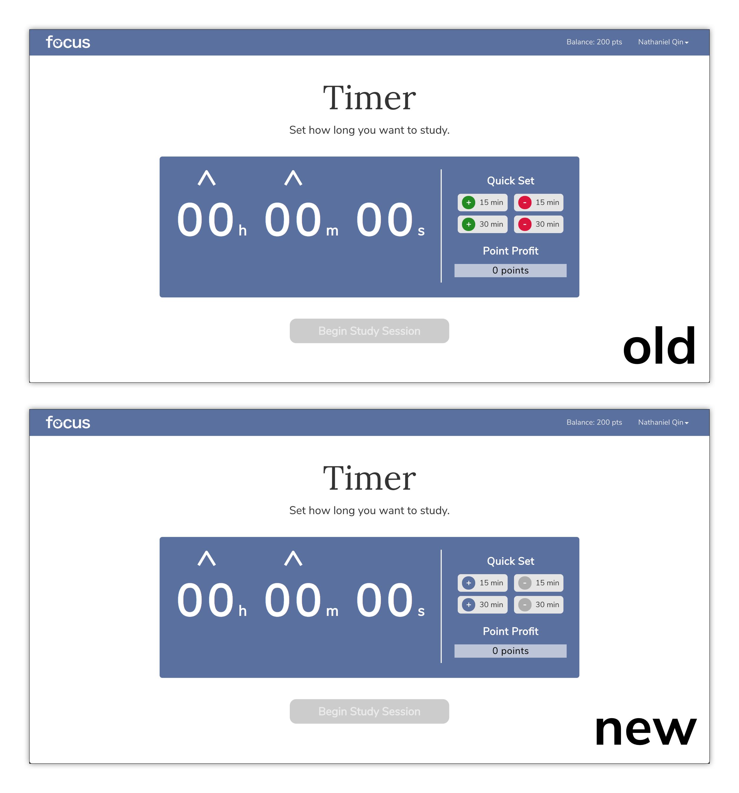
A comparison of our old and new timer pages. The colors of the quick set buttons were changed to be less attention-grabbing. Also, though not visible in this still image, we added a bouncing animation to the arrows in the hopes that the motion would draw users' attentions.
CONCLUSION
As a reminder, our initial design goal was as follows:
Design a solution that helps students stay focused even when they are distracted by outside factors and guide their study patterns to maximize productivity.
At the end of our project, we had addressed most of the main needs that we were aiming to. We had successfully created an application that minimized digital distractions to help students stay on task, maximizing their productivity. We did fall short in allowing students to still study using their computers, as the system we ended up with only allowed for studying using physical materials. The design process that we followed was also extremely thorough, and I especially loved that we went through iterations that were tweaked through feedback garnered from user testing.
NEXT STEPS
Better Incentives: Currently, the rewards that can be obtained through our shop are objectively bland. Although it may be nice to change the color of the application or have an animation crawl across the screen with the timer, they can get boring rather quickly. We definitely wanted to expand the rewards into something more enticing, like monetary coupon rewards. We also considered gamifying the application more by incorporating a social aspect for students to compete with their friends, but we ran out of time and resources at the end of the project term to follow through with this idea. We would definitely at least attempt implementing both of these options to solidify the rewards system.
Whitelisting: As mentioned earlier, the application only allows for studying using physical materials at the moment. Going forward, we definitely want to give students the option of still using their computer to study by designing a whitelist system in which they could designate certain websites related to studying as non-distractions. This way, productivity can be even further maximized and it can help for certain classes whose materials are all digital.
TOOLS
HTML5
CSS3
JavaScript
jQuery
Bootstrap
GitHub
Heroku
Sketch